![](https://cdn.myportfolio.com/b78d76a5-965a-4966-8675-d08b186c95f3/e6620e71-a6a7-4f57-b3d3-951daa5a5bfe_rw_1920.jpg?h=b5022074a6e54b389341b17b57b11f1e)
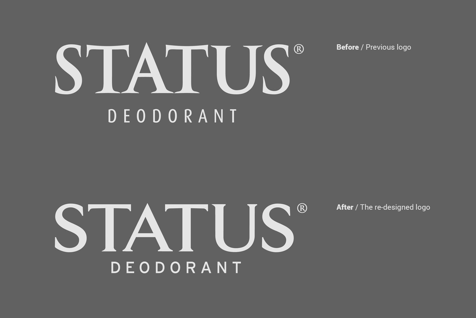
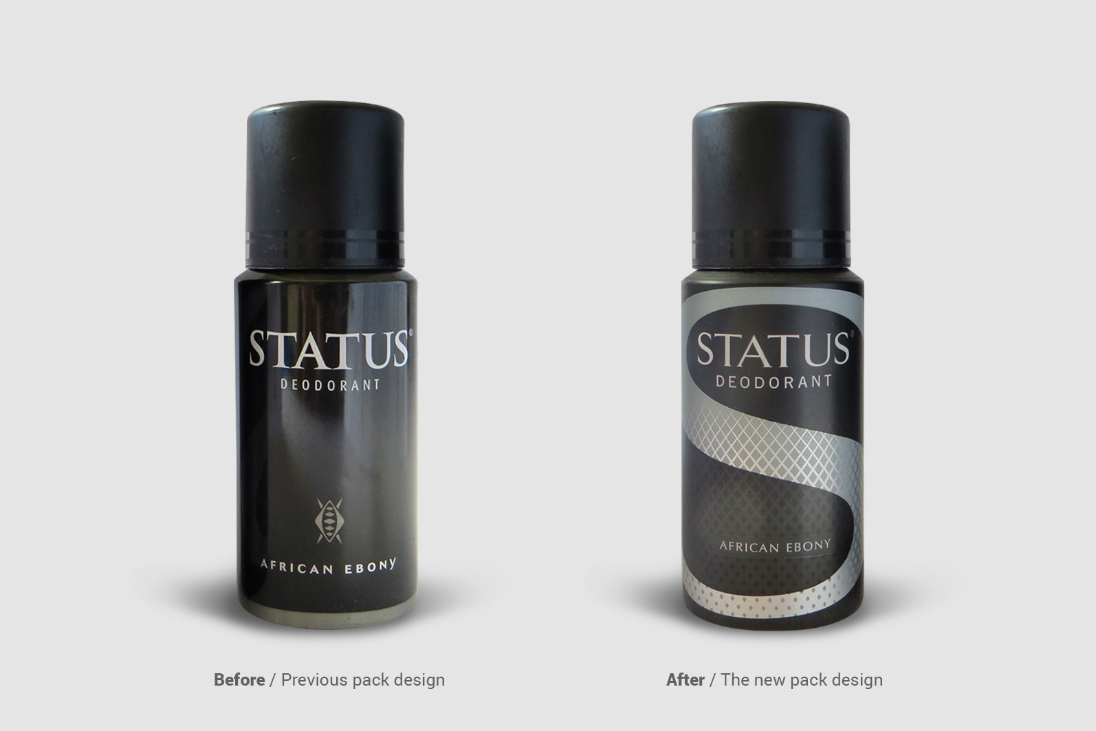
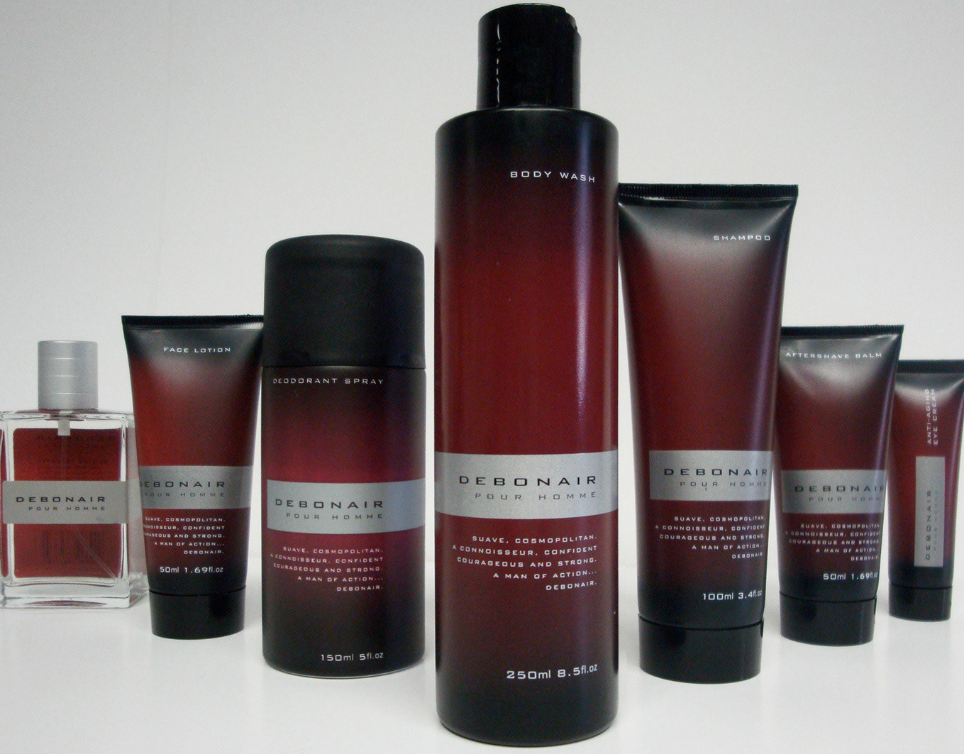
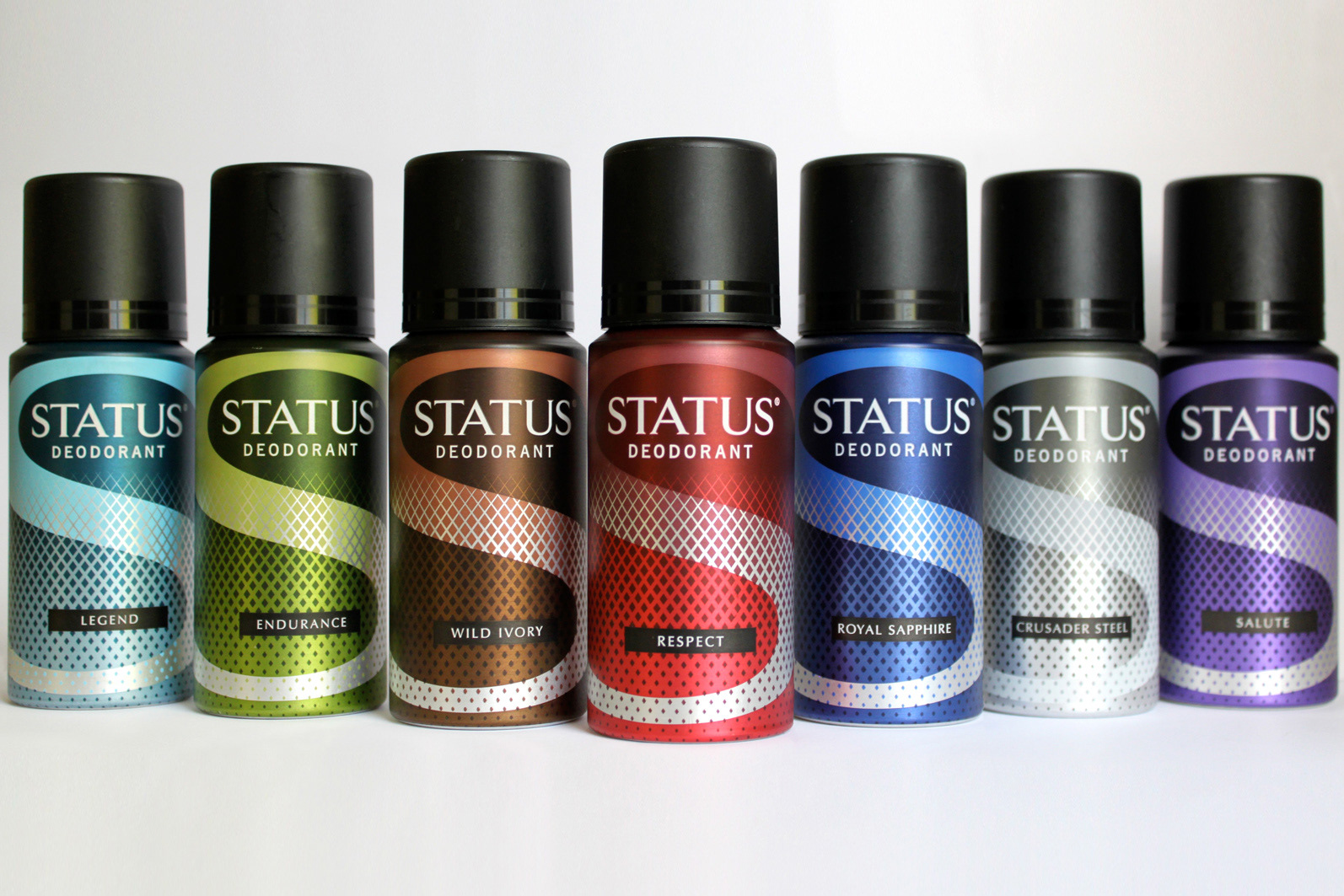
A revolutionary redesign of both brand and packaging that has a greater on shelf impact and increased sense of modernity. Addressing the brand, through the levelling the perimeter of the letters, the serif of the S was reduced and the stability increased. This initiated a sense of strength and masculinity whilst maintaining brand loyalty and recognition.
![](https://cdn.myportfolio.com/b78d76a5-965a-4966-8675-d08b186c95f3/f74d0ca4-16a6-4479-91bd-17ad14278d5c_rw_1920.jpg?h=5580ac65fff8c1a743d266bb5ac4988f)
![](https://cdn.myportfolio.com/b78d76a5-965a-4966-8675-d08b186c95f3/c794d0d0-ffc8-4271-9311-6dd2e32304b8_rw_1920.jpg?h=e16b4c0bab0b4d15d2897cc26813ae92)
![](https://cdn.myportfolio.com/b78d76a5-965a-4966-8675-d08b186c95f3/813ab325-c79e-4be7-9b67-aa7a4975c5a9_rw_1920.jpg?h=9c22bcc0cd4dc2eb513025668e6d82a6)
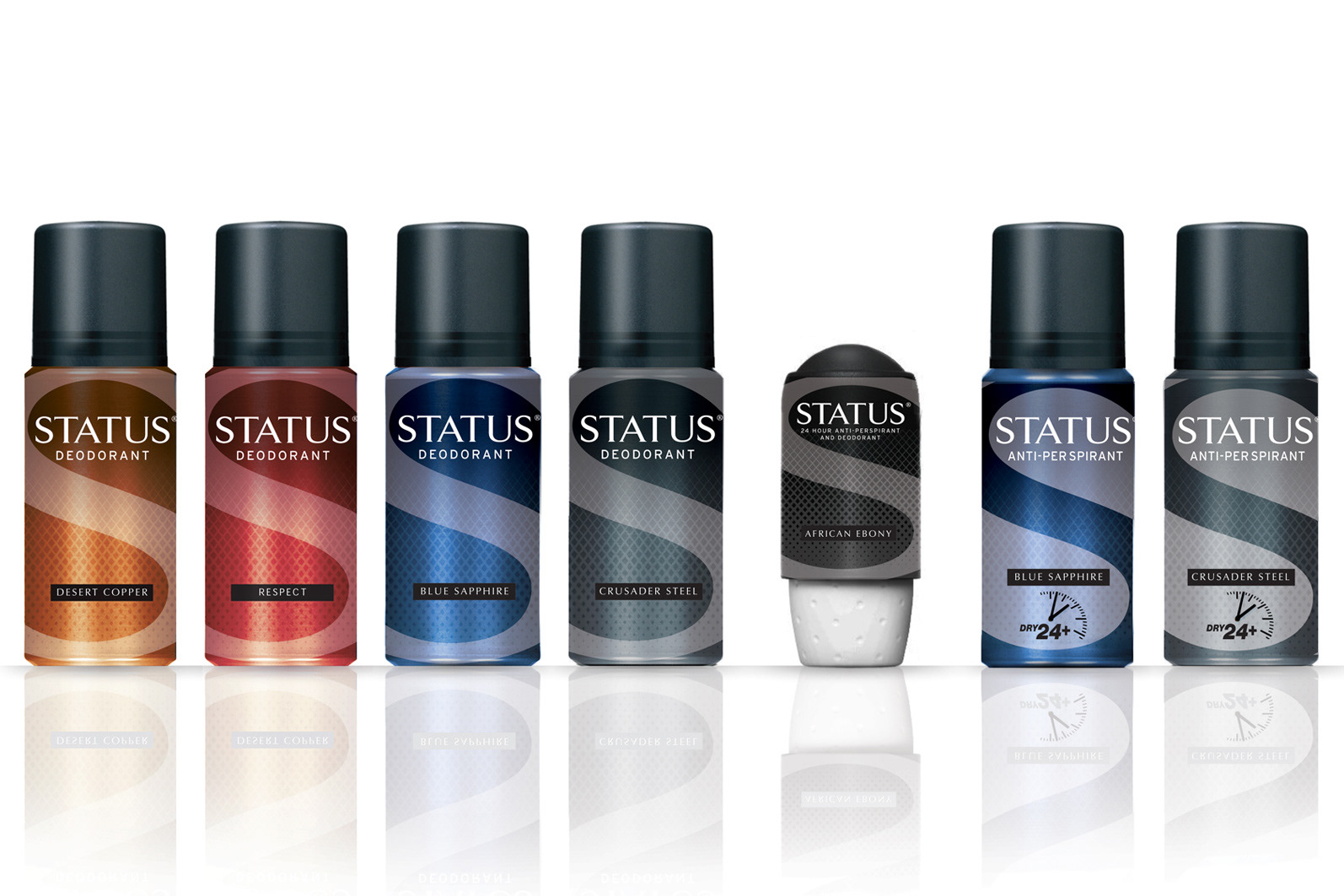
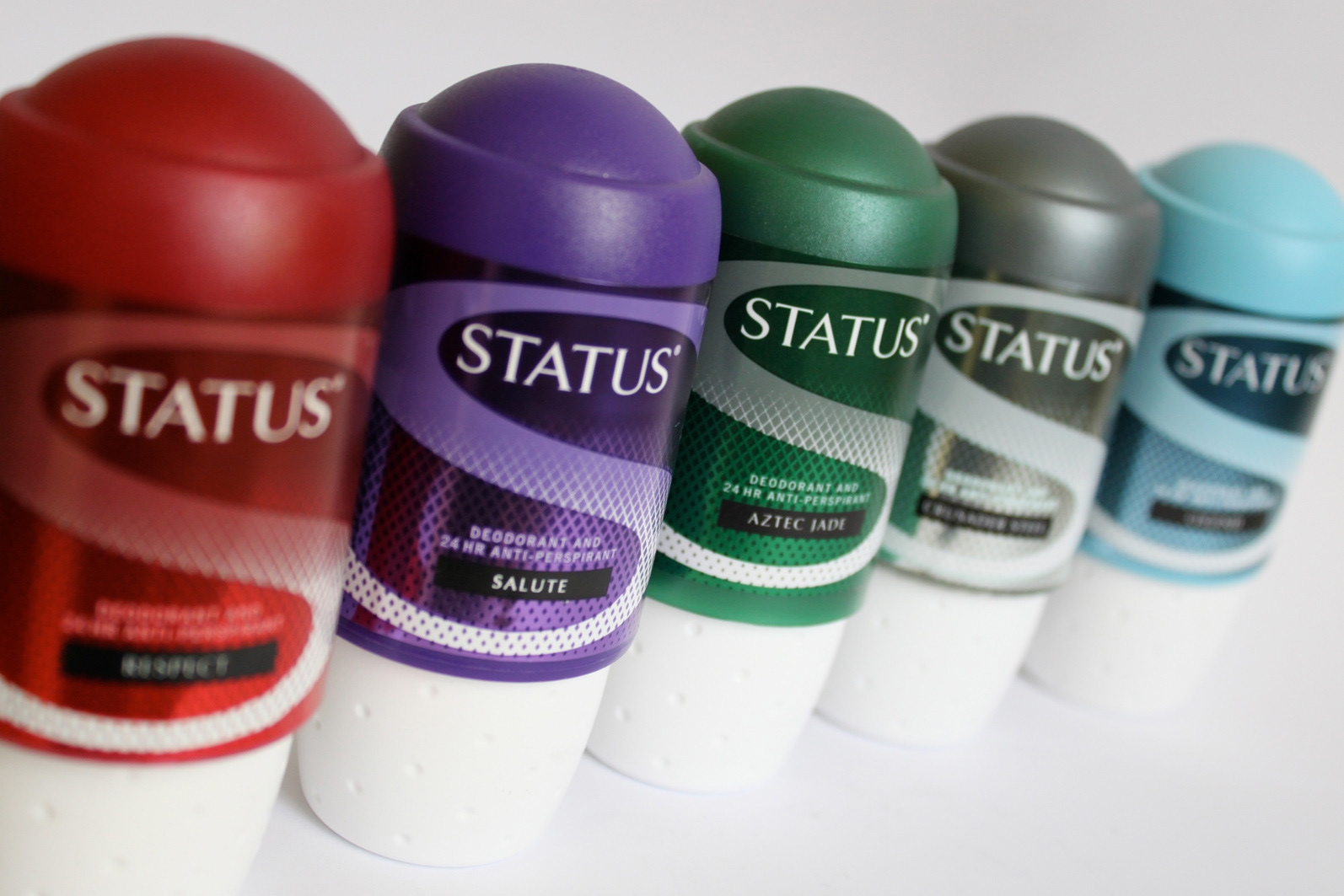
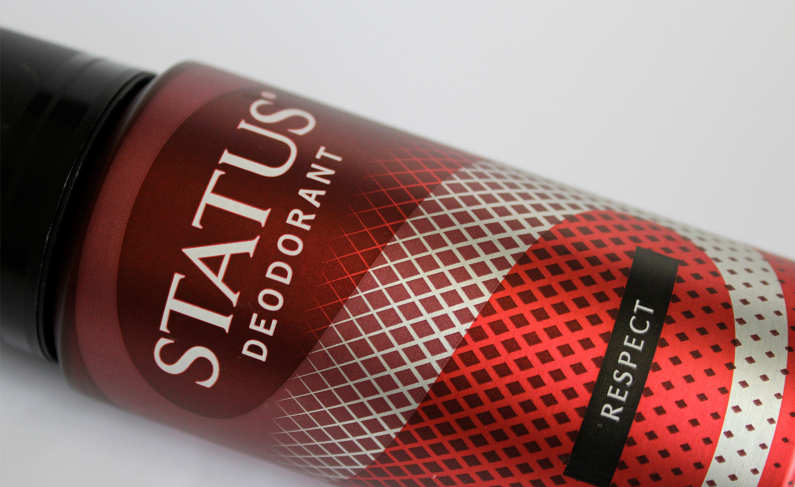
Vertical architecture use of the brand ‘S’ on the packaging served to both update and increase a perceived sense of size. The full brand wordmark and fragrance in a solid block added further structure and the bold use of colour and a graduated pattern served to clarify different variants. An overall matt finish pitches the brand and packaging to the identified male consumer.
![](https://cdn.myportfolio.com/b78d76a5-965a-4966-8675-d08b186c95f3/7040d2ca-8915-47c5-8cf1-24a73705c542_rw_1920.jpg?h=9fbc9a3b98e683a003a0243c834d64f5)
![](https://cdn.myportfolio.com/b78d76a5-965a-4966-8675-d08b186c95f3/c37b1a17-2199-40c0-85a1-475d7e614e15_rw_1920.jpg?h=dfdbc3f9f7b3d1487ef89c6c7cc2087d)
![](https://cdn.myportfolio.com/b78d76a5-965a-4966-8675-d08b186c95f3/b457f008-936c-4c97-b168-04ed269937f9_rw_1920.jpg?h=62585600a2377241d3c51abc433fed09)
![](https://cdn.myportfolio.com/b78d76a5-965a-4966-8675-d08b186c95f3/9a26b075-270e-4668-8efb-625db1add237_rw_1920.jpg?h=5b74ff16e629778d74fe1d73ae899169)