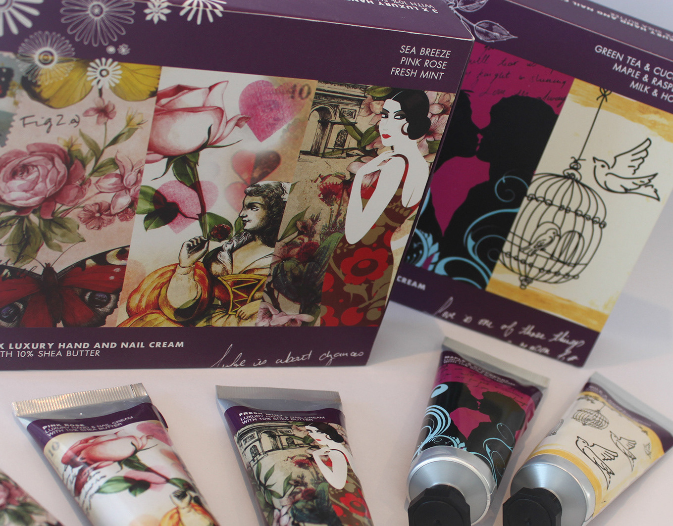
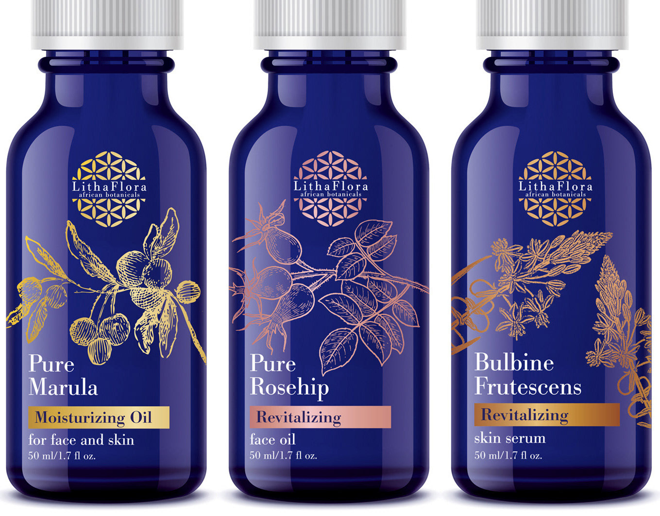
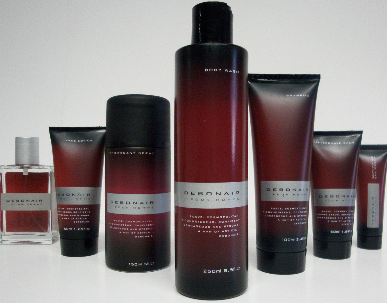
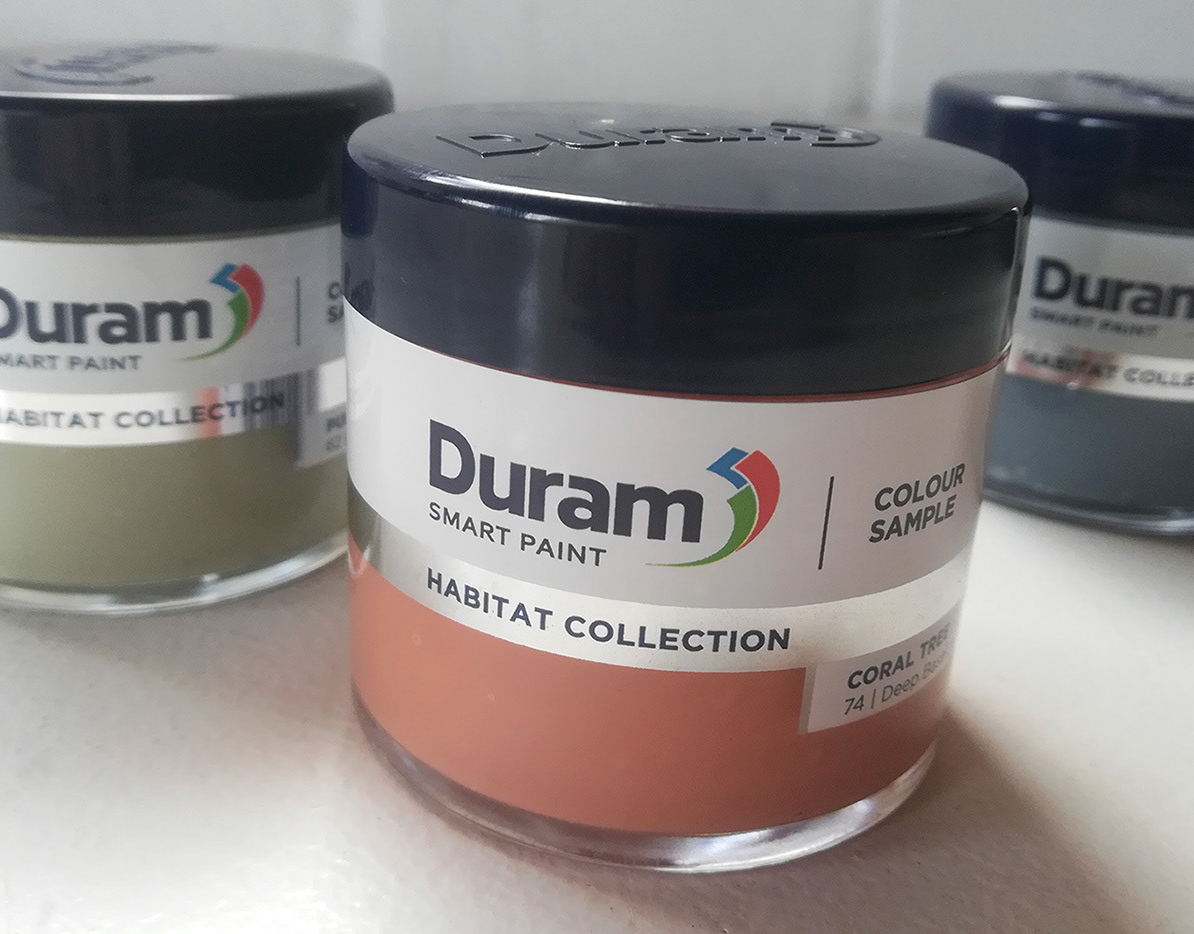
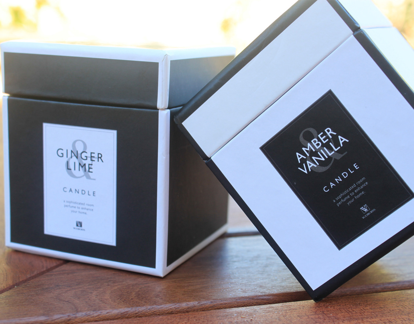
Creating as a new ‘limited edition’ variant for the long standing Simply Floral range, it was required to be recognisable within the brand, yet individual enough to gain customer attention. Acknowledging that a new and unique visual was necessary, I personally picked up my brush to create vibrant watercolour and pencil style images, more illustrative than the original brand. A mixture of serif and script fonts complemented the visuals, and all was applied to a selection of both opaque and transparent vessels.
Highly successful, the design proceeded to outsell original variants and quickly became a core range for the Simply Floral brand.


