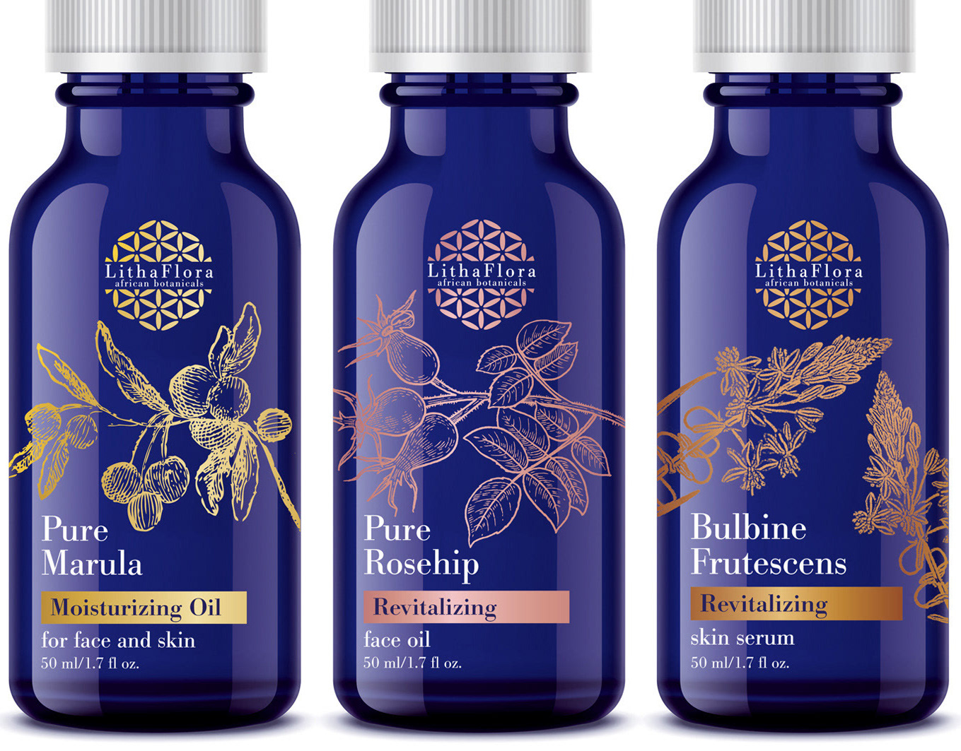
Todd Anderson Design had the great pleasure of working for Cape Town agency, Tag 8, on the branding and packaging design for the re-launch of the brand, Pradiance - a natural and organic skincare range that is scientifically formulated with African botanicals.
Recognising the powerful similarity in the 28 day cycle of both the moon and skin regeneration, lunar images took centre stage in the packaging design. The use of gold foil, against the dark slate colours of the packaging, bring a sense of sophistication and uniqueness within the products category.
The design was rolled out over the full range of products plus print and digital media.
www.pradiance.co.za


